Your Cart is Empty
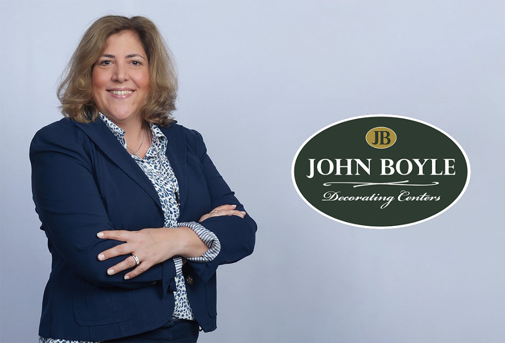
They say the essence of interior design is about people and how they live. Kelly Cruess not only embraces this principle, it’s clearly reflected in her projects.
“Nothing is more rewarding than having helped clients transform their home so that it can be lived in to its fullest potential,” she says.
An HSR (Home Staging Resource) certified designer, Kelly has been honing her craft since 2016, including three years working in her own staging and design business and winning the Best of Houzz Service Award consecutively between 2018-2020.
“I am known for working with a variety of design styles, and like mixing aesthetics and textures, but keeping projects simple and focused is still the best way to bring a clean form and function to any space,” she says, adding that one way to achieve this is through selecting the right colors.
“Color inspiration is often found in the unique accent pieces, artwork, pillows and furniture currently in the client’s home that speaks to their personal style,” she says. “I always want to make sure my design reflects their preferences and meets their needs so that they are happy and excited about the changes we’ve made to their space.”
Favorite space to design: I love to decorate living rooms because there is so much that can be done in this space in terms of color, form, function, accent pieces, artwork… the list goes on. Those thoughtful touches help create a place of comfort, not only for the owners, but for those they welcome into their home to share the enjoyment of that space.
Any design quirks or superstitions? Not really, although come to think of it, I tend to use design accents like pillows in odd numbers. Groups of 3 or 5, especially when arranged in various sizes, textures, and color combinations can create an interesting and unexpected look.
What color “rule” was made to be broken? That you should use only light colors in small spaces. That’s simply untrue. Using dark colors in areas such as the hallway, laundry or powder room makes the space feel warm, cozy and inviting.
Favorite place to find inspiration: Interior design publications. I enjoy browsing different magazines to find ideas and inspiration for other people’s homes as much as to decorate my own. I like going antiquing for the same reason.
The celebrity designer I’d love to spend the day with: I have a fondness and expertise in farmhouse-style décor, so definitely Joanna Gaines. I’d also have to say Alison Victoria from HGTV’s Windy City Rehab. She has great vision and is always incorporating unique pieces and antiques in her design renovations.
Paint or wallpaper? I prefer paint because it’s versatile and I’m always amazed by how something as simple as a fresh coat of paint can transform an entire room. But I have to say that I also love using wallpaper on an accent wall or to give a room a sense of fun and whimsy.
What’s your design superpower? Being able to take a space, visualize how it works for function while being aesthetically pleasing, and then – Bam! – transforming it into a place that my clients immediately fall in love with.
Your home deserves careful consideration when making alterations. Bring your interior design hopes and dreams to life at John Boyle Decorating Centre. Book a consultation with one of our talented team members.

For 50 years, Benjamin Moore's Historical Color Collection has brought the character of 18th- and 19th-century design into modern homes. From the quiet confidence of Stonington Gray to the bold statement of Heritage Red, these are the shades that never go out of style. Take a look back at where the collection began, and discover the ten colors still shaping homes today.

Discover Raindance 1572 from the Benjamin Moore Color Trends 2026 palette. Explore pairing ideas, similar hues, and expert color guidance from John Boyle Decorating Company, Connecticut

Explore Southwest Pottery 048 from the Benjamin Moore Color Trends 2026 palette. Discover pairing ideas, similar hues, and expert color guidance from John Boyle Decorating Company, your local Benjamin Moore dealer in Connecticut